Using Color on the Web
The following are baseline requirements for using color on the web that complies with Section 508 standards for web-based intranet and internet information and applications.
Contrast
Make it easier for users to see and hear content by separating foreground from background and using colors that contrast well against each other. Due to the variety of color deficiencies, it is recommended you test your colors and images with the color blind simulator. You also may test color combinations to ensure good contrast.
DO:
Do use colors that contrast well against each other.
Example:

DON'T:
Don't use complementary colors, bright colors, or low contrasting colors against each other.
Example:

Using Color to Convey Meaning
DO:
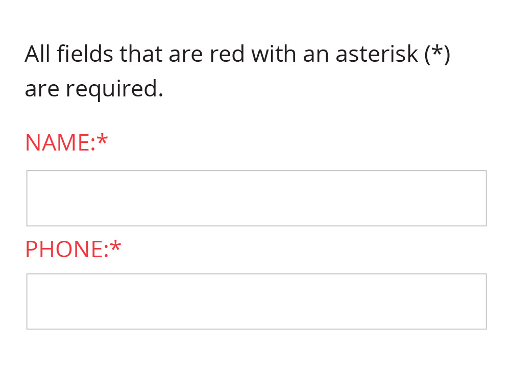
Do use color with another differentiation to distinguish visual elements.
Example:

DON'T:
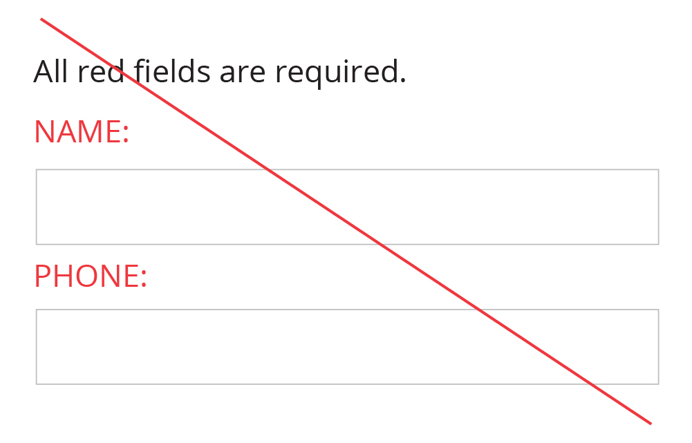
Don't use color as the sole method of distinguishing visual elements.
Example:

Color in Links
Color alone is not to be used to distinguish links from surrounding text unless the luminance contrast between the link and the surrounding text is at least 3:1 and an additional differentiation (e.g., it becomes underlined) is provided when the link is hovered over or receives focus.
DO:
Do use a high contrast color and underline to distinguish links in text.
Example:

DON'T:
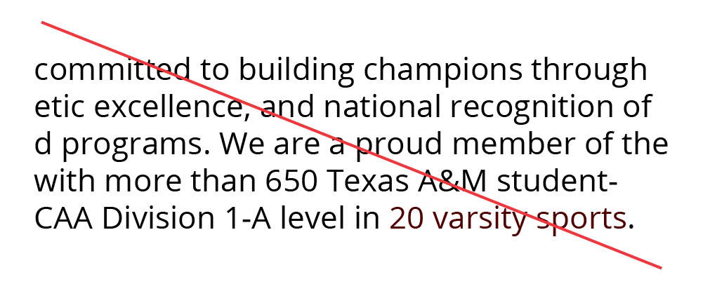
Don't use maroon alone to determine a link (not sufficient contrast between black and maroon text).
Example:

