Design Elements
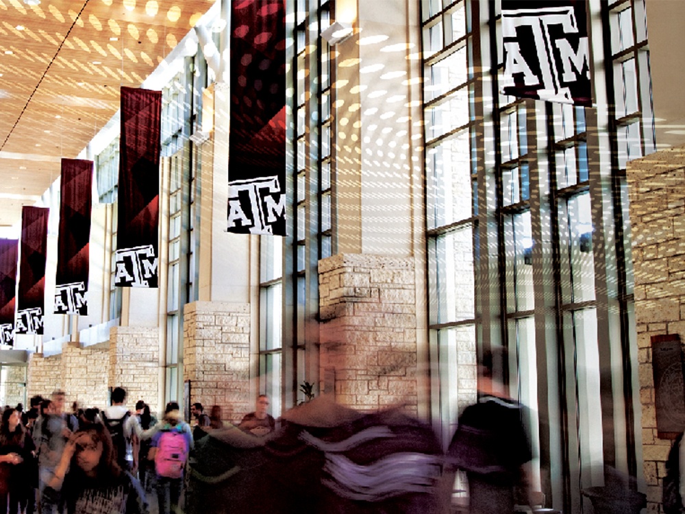
Use the design elements on this page to create a consistent look and feel across all of your marketing and communications materials. It is not necessary to use all of the elements together in every application.
Download Design ElementsTexture
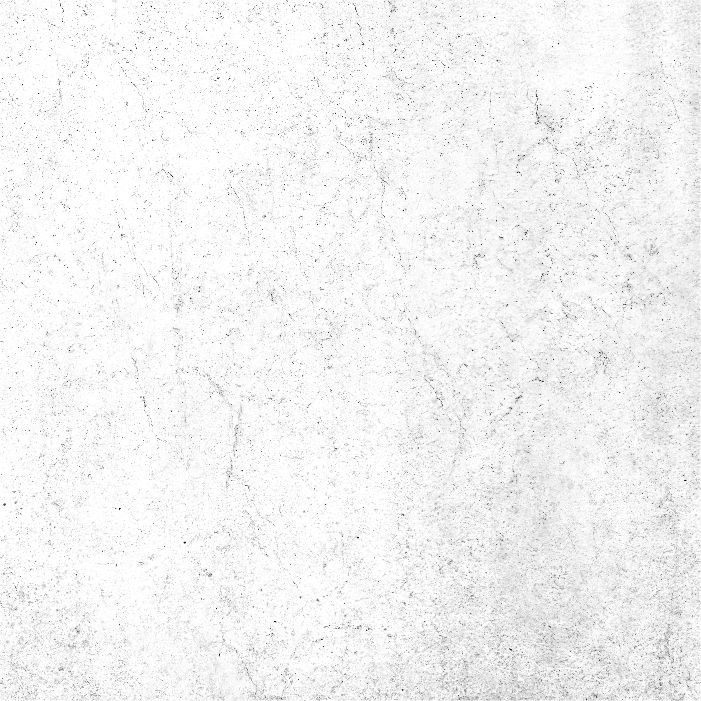
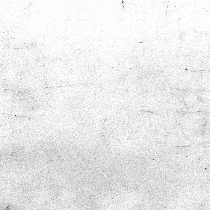
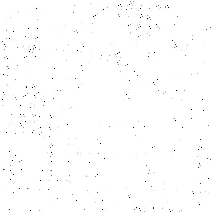
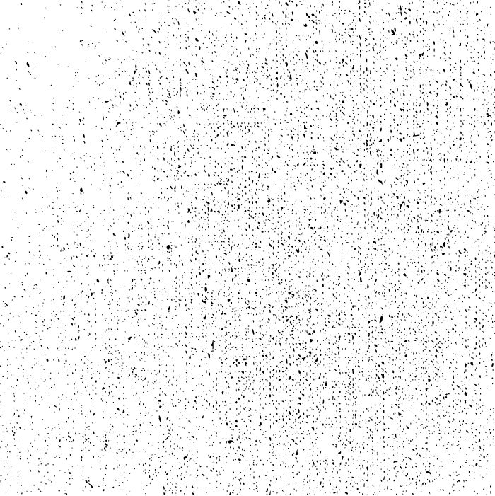
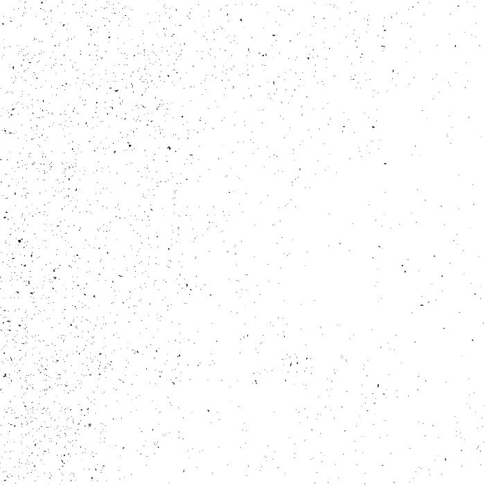
This texture set is used to add depth to the brand. They can be used as an overlay on entire compositions or to treat specific elements such as typography or photography. They should be subtle and act as a supporting element. They can be colorized using the secondary color palette. Avoid over texturing and excessive contrast. See the examples below for reference.
Red Line
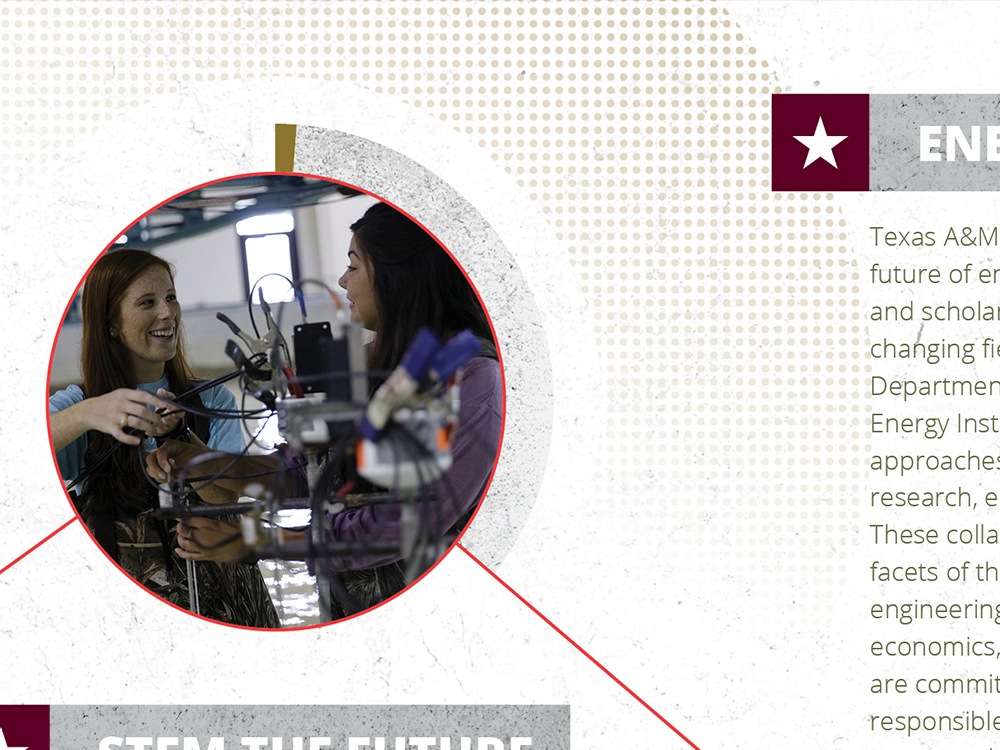
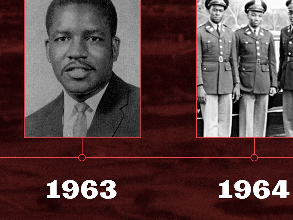
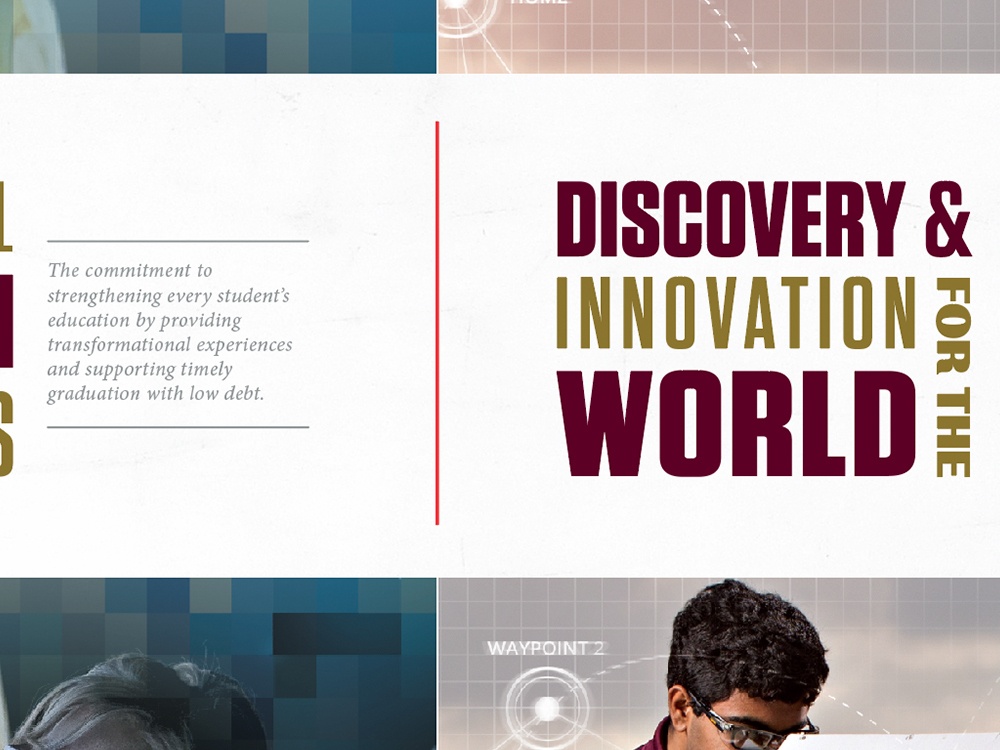
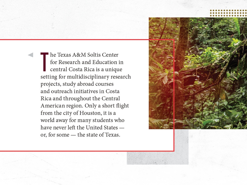
This red line is a subtle way to represent the fearless front and can be used in a range of ways, from an accent to a feature graphic element. The line should be thin and interact with the content of the composition. This red accent color is referenced in the Brand Colors section.
Yellow Bar
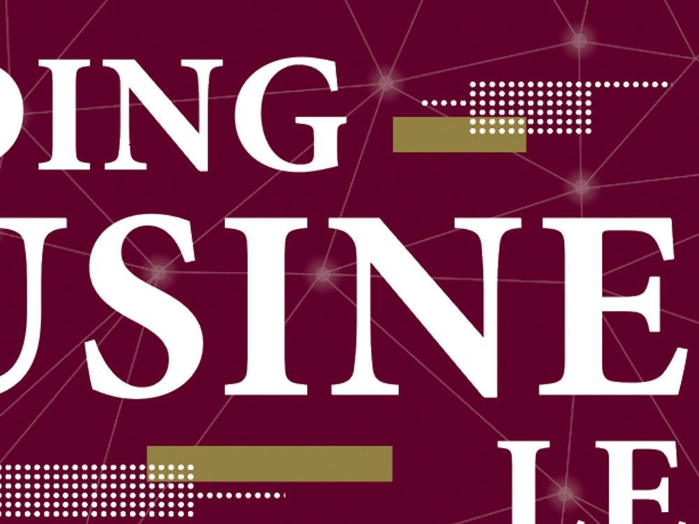
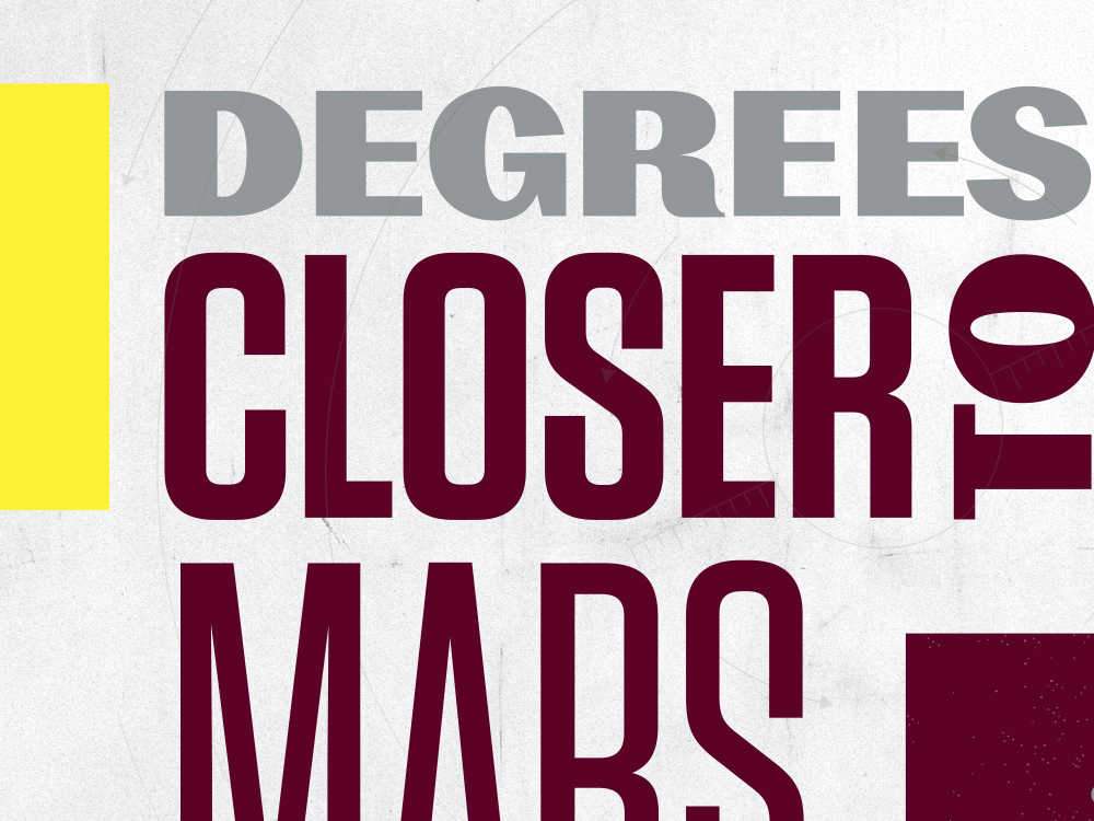
The yellow bar design element can be used to draw attention to particular information, to add visual interest or to anchor a communications piece by applying it to the edges, top or bottom. The yellow bar color is referenced in the Brand Colors section.


Dot Grids
The dot grid can be used unaltered or warped, allowing for a wide-range of applications. It can be any color in the palette. Borders, background accents, photography overlays and headline fills are all acceptable uses. Try layering and interaction with photos or typography to add depth and visual interest.
