Logo Guidelines
When using any Texas A&M logo, be sure to scale all marks proportionally, and use the electronic logo files as provided in the Logo Downloads section with registered trademark symbol. Note the incorrect use cases below:
Don't:
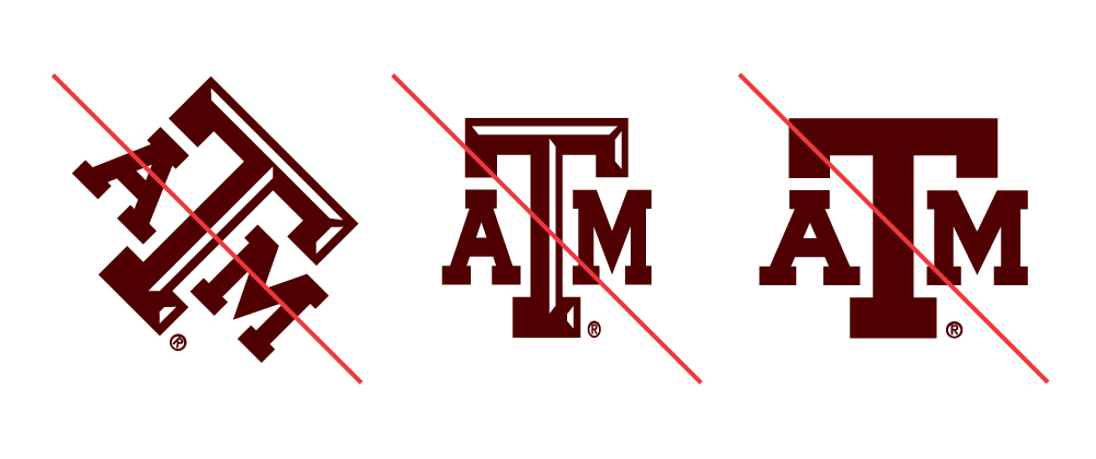
Don't distort, modify or remove elements from the official university logos provided in the Logo Downloads section.
Example:
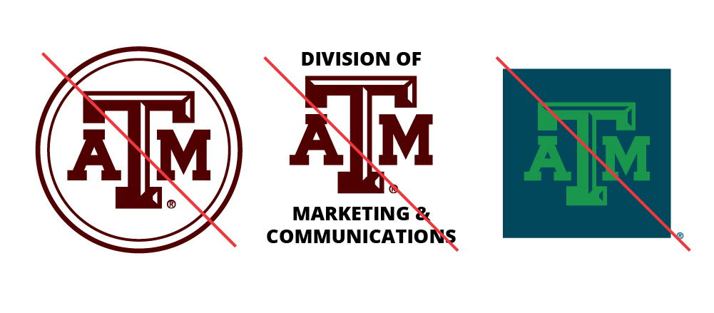
Don't create your own logo, use incorrect colors or add elements to the official university logos.
Example:
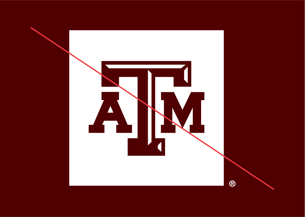
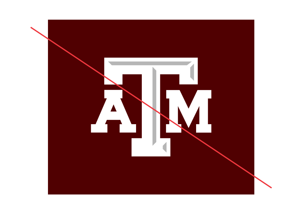
Don't reverse the TAM Logo Box as white with a maroon TAM.
Example:
Don't recreate the TAM Logo Box with a different size box.
Example:
Clear Space
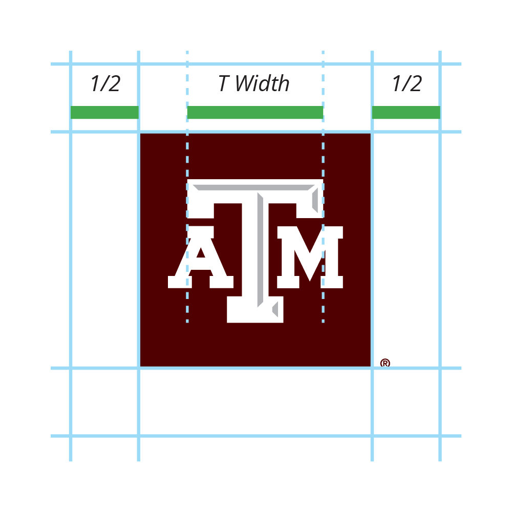
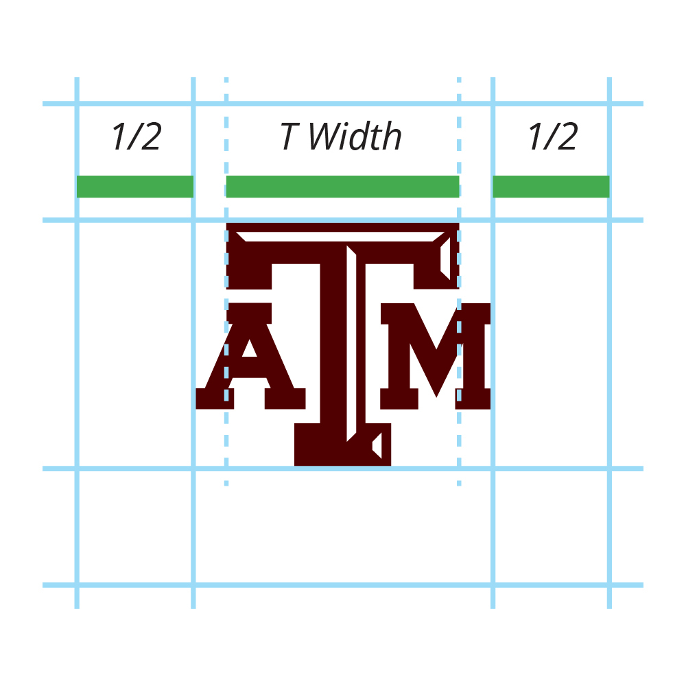
Clear space is necessary to provide breathing room around the unit identity. Leave a clear space around the top, bottom, left and right of the logo that is half of the “T width” in the TAM.
Minimum Size
To ensure legibility, logos and unit identities must not be reduced beyond the following defined minimum size:
- Logos and unit identities should not be printed smaller than .5 inches tall.
- When displayed on screen, they should never appear smaller than 30 pixels tall.
- When embroidered, they should never be sewn smaller than 1.125 inches tall.
Multiple Unit Identities
If you need to identify more than one university entity equally on a communication, use the following guideline:
DO:
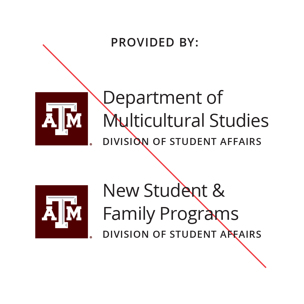
Do use one logo, preferably the TAM logo box, and list multiple units as part of the content or within the design.

DON'T:
Don’t use more than one unit identity in the same design space (ie the same page of a print communication, t-shirt or website page).
